Tag Archives: maps

Data viz: 19th Century Edition

By Christopher B. Daly 

Thanks to TNR and this terrific piece by Susan Schulten about two very powerful maps that could have (and should have) shaped the settlement of the United States. Essentially, they tell the same story: do not attempt European-style agriculture west of the long-grass Great Plains. 

Here’s a map made by the great one-armed Western explorer John Wesley Powell for the U.S. Geological Survey:

drainage_thumb

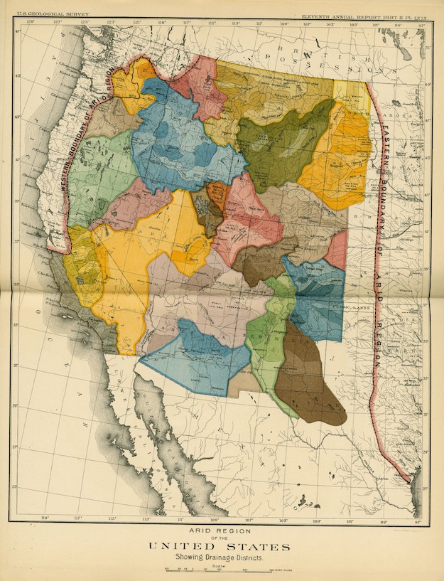
In it, he drew a north-south line from the middle of North Dakota to Houston and warned against even attempting to farm those areas (except for the far West Coast). The wonderfully colored areas depict the watersheds of the region’s major rivers.


And here’s an earlier map showing rainfall totals across the country. Again, the message is pretty clear.

U.S. rain chart

U.S. rain chart


3 Comments

Filed under history

Fun with maps: Visualizing global wealth

By Christopher B. Daly 

Here is a terrific map that uses data visualization to dramatize the disparities in how well-off people are around the world. The map-makers at Worldmapper redrew the size of each country based on its per-capita GDP.

In the map below, several things stand out:

1. The bulging size of the USA compared to other countries.

2. That big purple area on the right is not China but Japan (which is much wealthier per capita).

3. Although it is is geographically huge, Africa practically vanishes (followed closely by South America).

Per-capita GDP by Worldmapper

Per-capita GDP
by Worldmapper

h/t to Vox for pointing to this.

2 Comments

Filed under Uncategorized

Fun with maps: American history edition

By Christopher B. Daly 

A big hat-tip to The University of Richmond for its excellent work in digitizing an important collection of historical maps of the United States. The source material is the great Atlas of the Historical Geography of the United States, published in 1932 by scholars Charles O. Paullin and John K. Wright. Now, the maps have been digitized, so they are much more accessible and actually more informative, since some of the changes those old maps documented can now be animated.

Credit goes to the Digital Scholarship Lab and the Mellon Foundation.

Here are two of my favorites:

1. This one shows rates of travel as of 1857, taking New York City as the starting point. It allows you to see how far apart different places in America were near the eve of the Civil War.

Screen Shot 2014-01-13 at 1.10.31 PM

2. This one shows how wealth was distributed in 1880. Surprise: Nevada had the highest per-capita wealth, probably because it had so many silver mines and so few people.

Screen Shot 2014-01-13 at 1.16.06 PM

1 Comment

Filed under history, Uncategorized

Fun with maps: A U.S. map with equal pop.s

What if the United States still had 50 states but they all had a roughly equal population?

It might look something like this fantastic map, drawn by mapmaker Neil Freeman.

From Pocono to Shasta, from Atchafalaya to Mesabi, this land is made for you and me. electoral10-1100


Funny thing: in this map, the big states in the West are even bigger, because NOBODY LIVES THERE. In this map, places like Boston and Throgs Neck and San Fran get their own pairs of senators, because people actually live here. If the map looked like this, maybe presidential campaigns would be about mass transit instead of guns.


2 Comments

Filed under Politics