
By Christopher B. Daly
A big hat-tip to The University of Richmond for its excellent work in digitizing an important collection of historical maps of the United States. The source material is the great Atlas of the Historical Geography of the United States, published in 1932 by scholars Charles O. Paullin and John K. Wright. Now, the maps have been digitized, so they are much more accessible and actually more informative, since some of the changes those old maps documented can now be animated.
Credit goes to the Digital Scholarship Lab and the Mellon Foundation.
Here are two of my favorites:
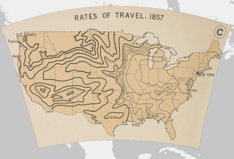
1. This one shows rates of travel as of 1857, taking New York City as the starting point. It allows you to see how far apart different places in America were near the eve of the Civil War.
2. This one shows how wealth was distributed in 1880. Surprise: Nevada had the highest per-capita wealth, probably because it had so many silver mines and so few people.

